A modular logo and branding system for a cutting-edge SaaS industry leader.
Focused on paid search monitoring and content monitoring, BrandVerity works to highlight important information in a sea of noise. This rebrand hones in on the strength, trustworthiness, and literal highlighting that encompasses the mission and direction of the company.
Modular Logo
A selection of logos from the full available set. While the top (blue underline) is the most frequently used logo, there are over 30 logo variations available for use.
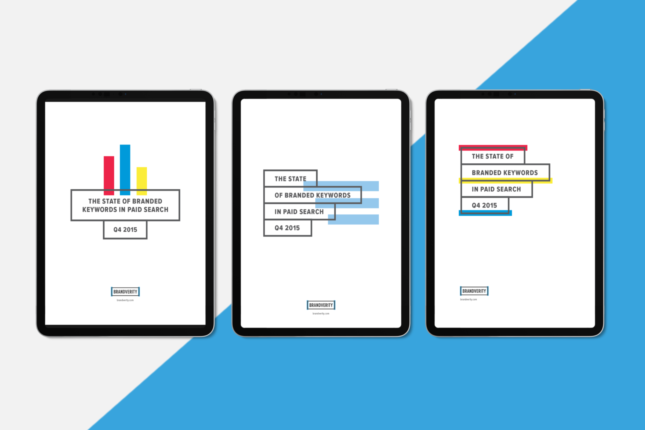
Ebooks
Highlighting works beyond the modular logo; strong line-weights and pops of highlight color allow for plenty of flexibility and visual interest across various mediums.
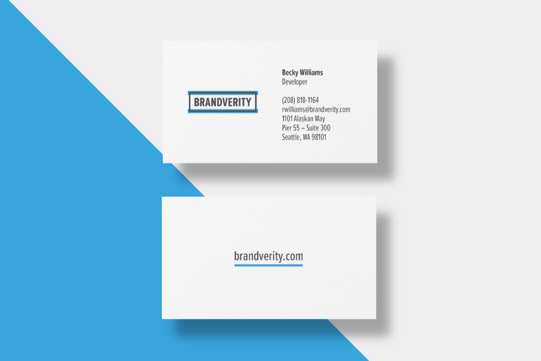
Personalized Business Cards
This is my favorite part of the whole rebrand: personalized business cards. There was a set collection of 10 that employees could choose from, or they could opt to work with me for a custom logo.
My personal favorite? The CTO, Andy, who used the highlight to underscore the letters in his name [which happen to fall in the correct order, what are the odds :)].
??