Using and opportunity to bring the SaaS interface up to new brand standards to improve the user experience.
I had the opportunity to design, and submit code on, the changes that I needed to make to the interface to bring it up to the new brand standards created after the full company rebrand. I decided to tackle a few usability/ease of use issues, looking to improve overall hierarchy and table layout/comprehension while bringing the look up to speed.
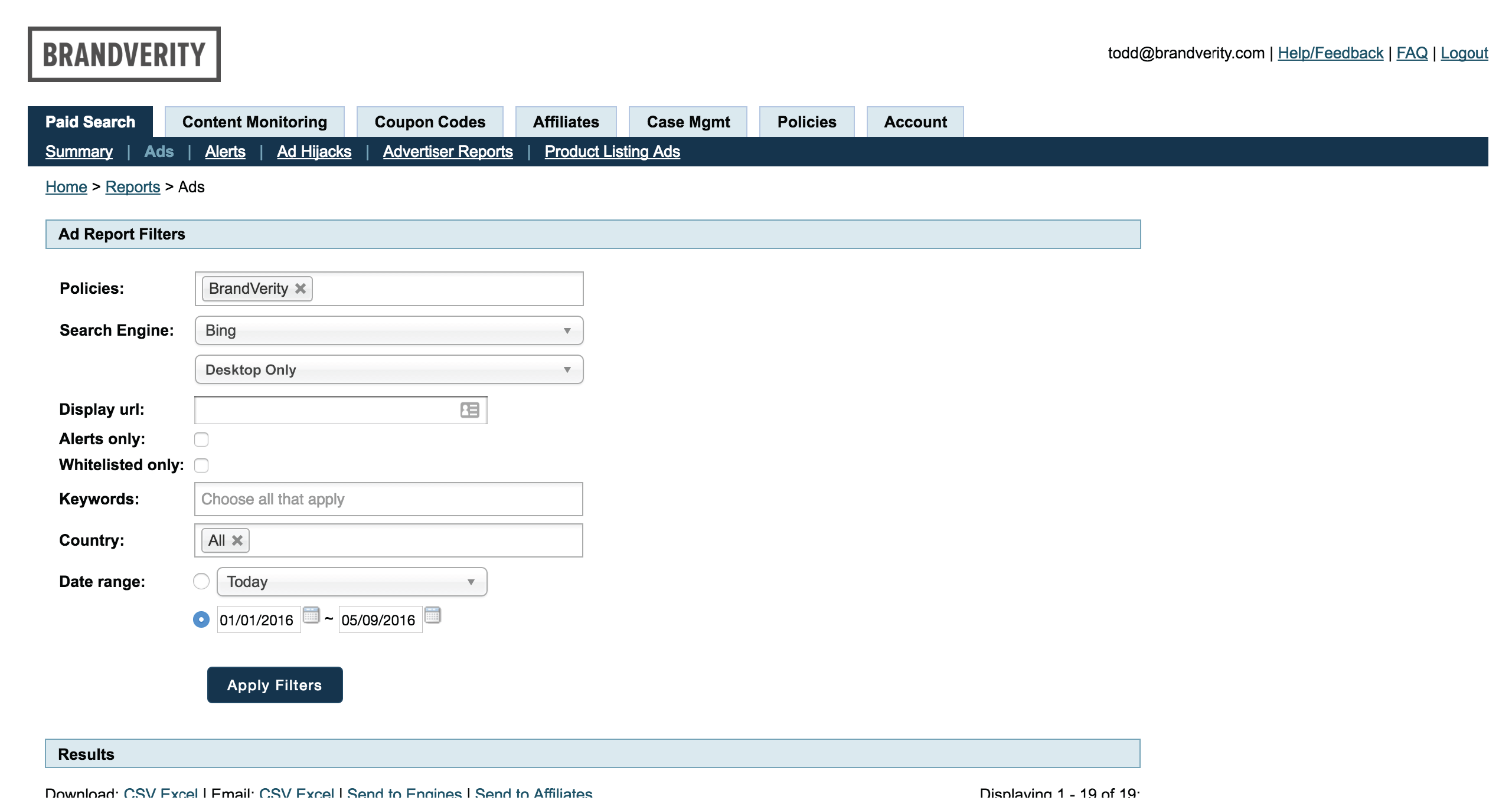
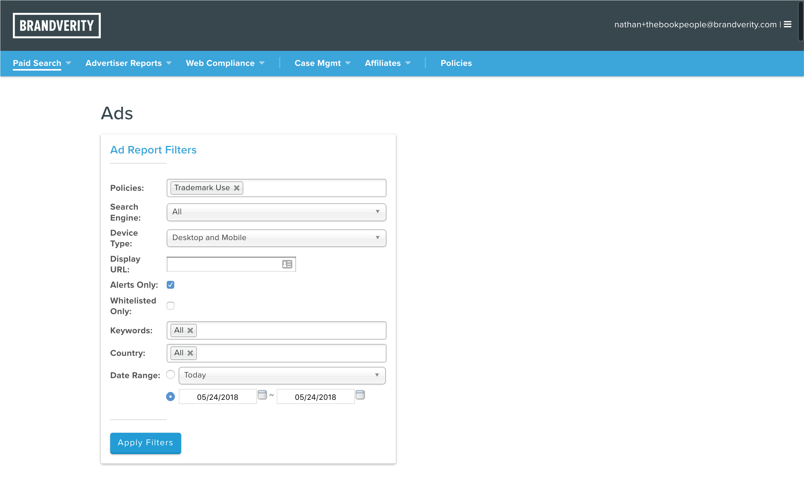
Filters
Our users lived in this section of the app, as they needed to filter results down to manageable numbers. The refresh provided better typographic hierarchy and a more clearly delineated filter section.
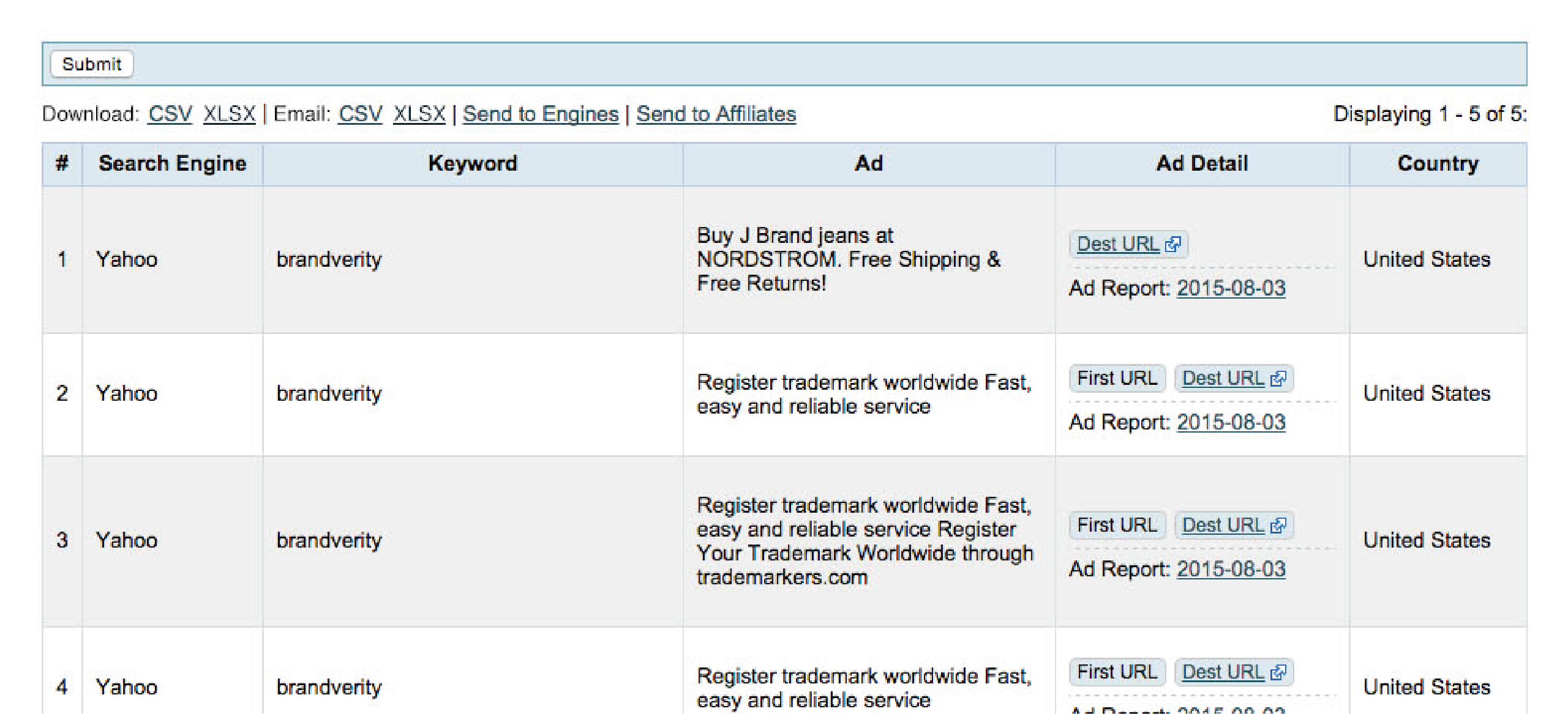
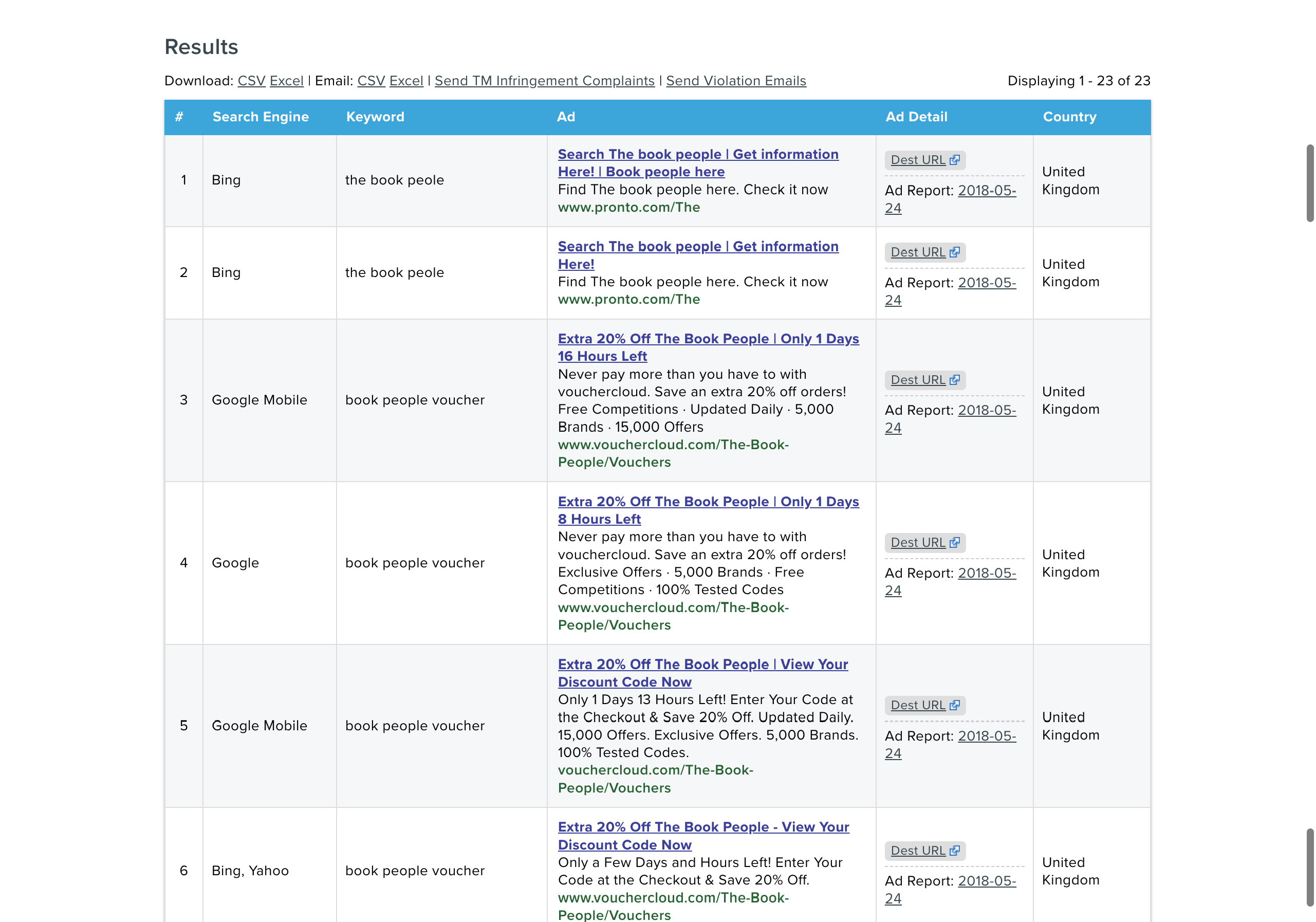
Table
The results that follow from the above filter section are the most important, and also the most daunting to look at. The goal here was to improve the look and feel through refreshed ad views, as well as improve usability through spacing.
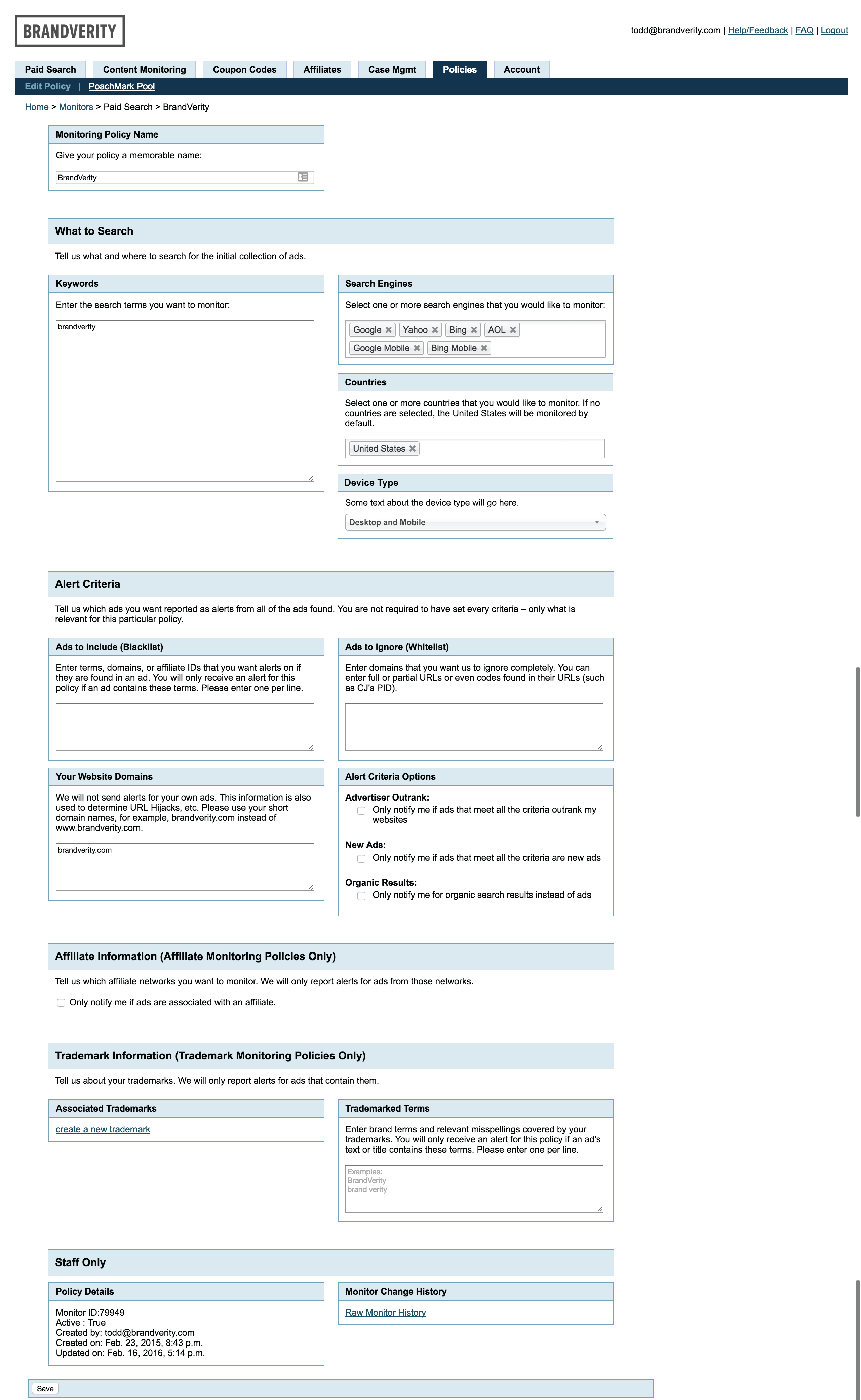
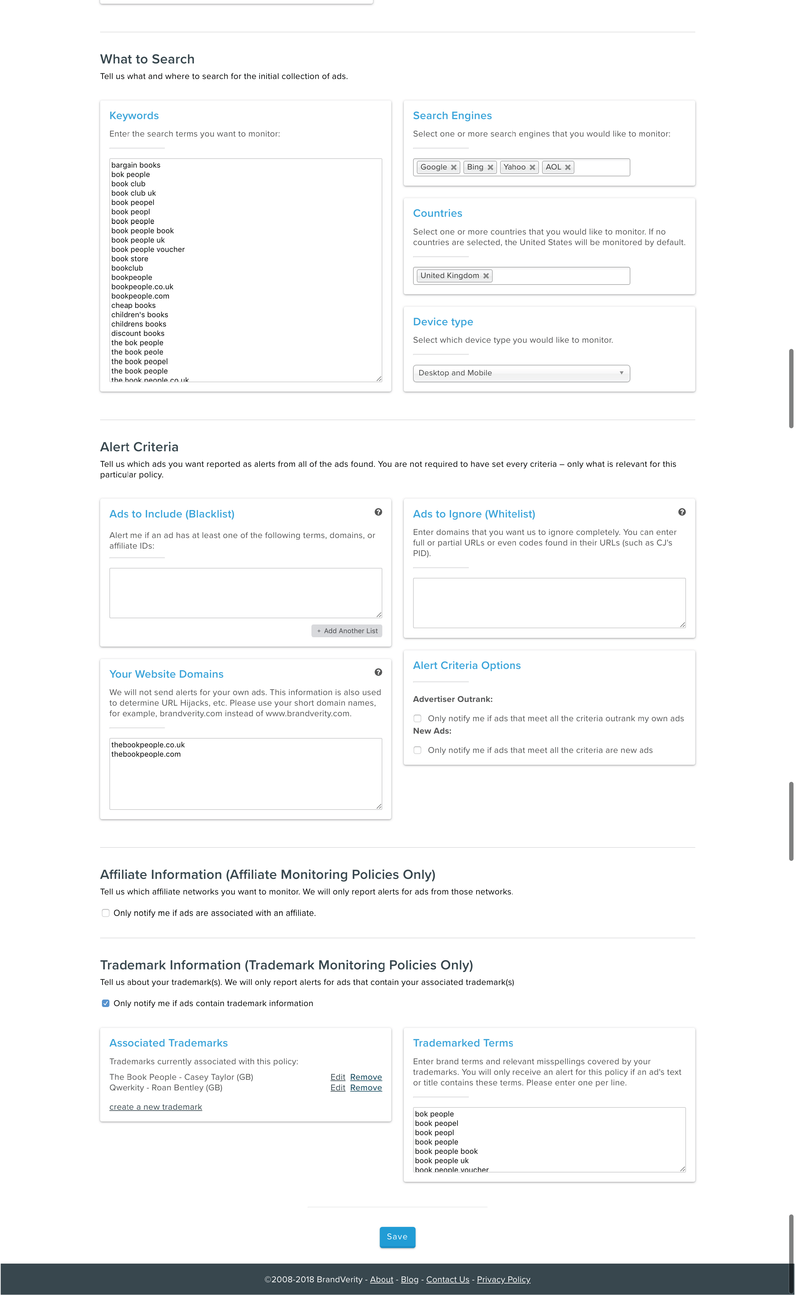
Policy
The Policy Creation section was incredibly daunting for our users. While this visual update didn't address some of the larger concerns, it helped to provide greater hierarchy, allowing the users to more easily navigate towards the sections they needed to update.
??